Zen Planner’s First Mobile App
Strategic Challenge
Member Connect was slow and clunky on mobile, leading to low engagement as competitors launched native apps.
We set out to design a fast, mobile-first experience that could support a wide range of fitness businesses.
My role
Led design for Zen Planner's first native member app from discovery through launch. Conducted user interviews, defined the MVP, prototyped and tested workflows, and designed the final UI for iOS and Android. Partnered closely with engineering through handoff and QA to ensure a high-quality release and establish a foundation for future features.
Key outcomes
- 50K users in 6 months
- 60%+ of logins shifted from desktop to mobile
- +40% DAU after launch
Context
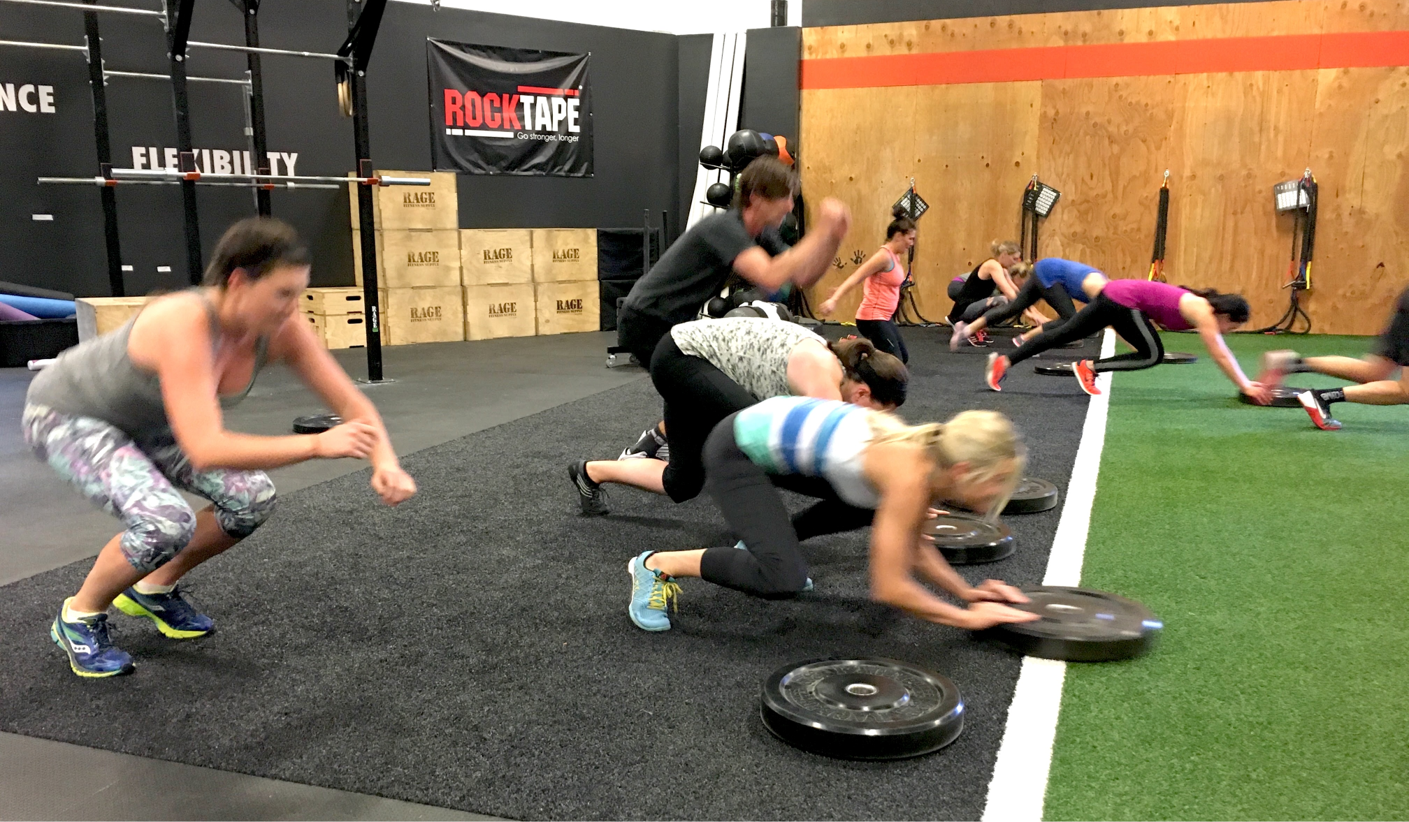
Zen Planner served thousands of small fitness businesses, from martial arts schools to CrossFit gyms, but its web-based member experience wasn't keeping up. Members had to log in repeatedly on a mobile browser just to check schedules, reserve classes, or view workouts. Engagement was low, and gym owners were frustrated by the lack of a native solution. Surveys revealed that over 70% of members accessed the platform exclusively from their phones, often while on the move, in a rush, or mid-workout.
At the same time, competitors were launching dedicated mobile apps, raising customer expectations and putting retention at risk. To stay competitive, we had to build a fast, intuitive, mobile-first experience from the ground up.
Process
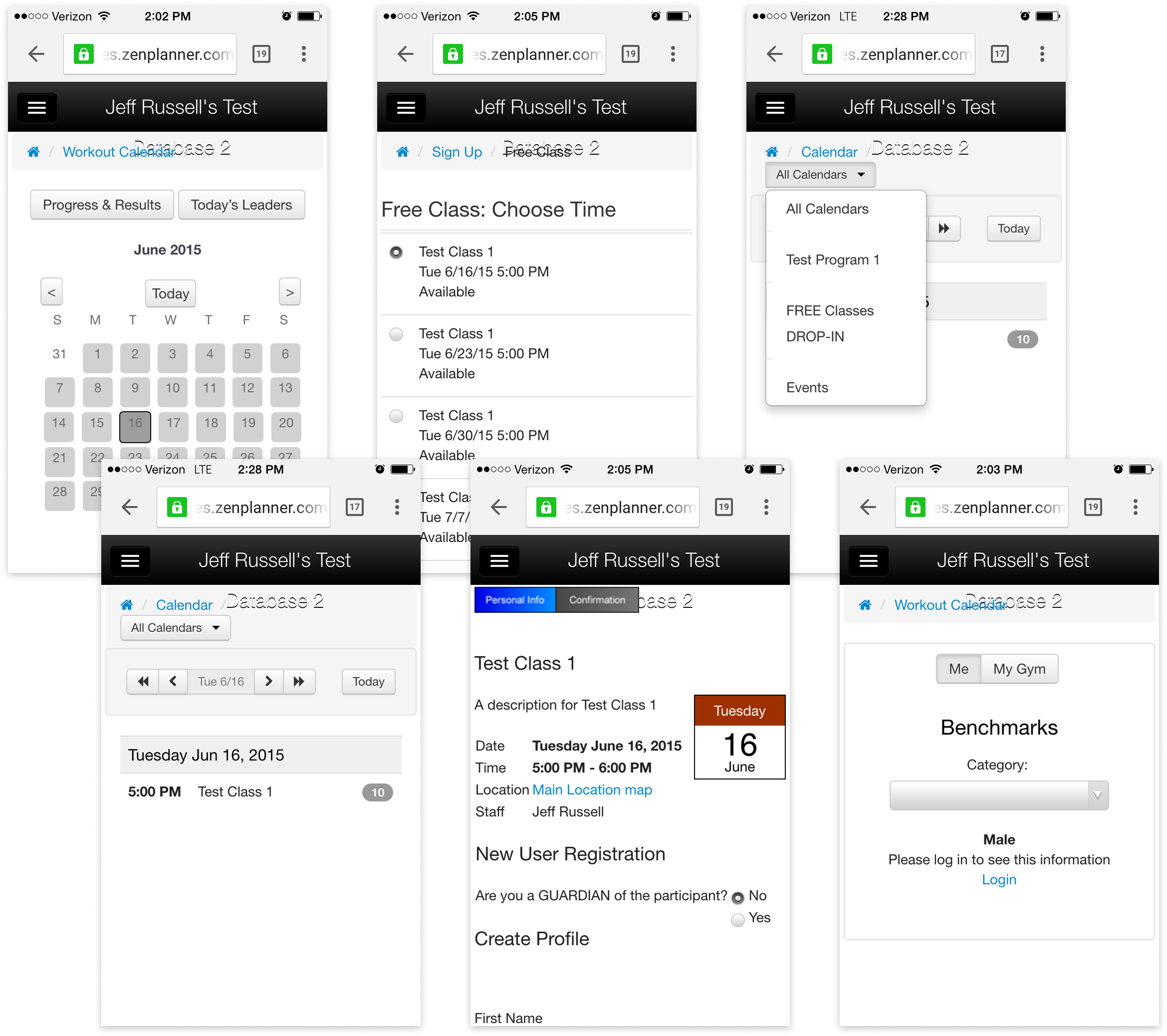
Designing for “fitness members” meant designing for everyone: martial arts students, yoga practitioners, parents booking for kids, competitive athletes, and casual class-goers. Every gym used Zen Planner a little differently, and every member had different expectations. The old web experience tried to offer everything but prioritized nothing, which made key workflows like reserving a class, checking a schedule, or viewing a workout especially frustrating on mobile.
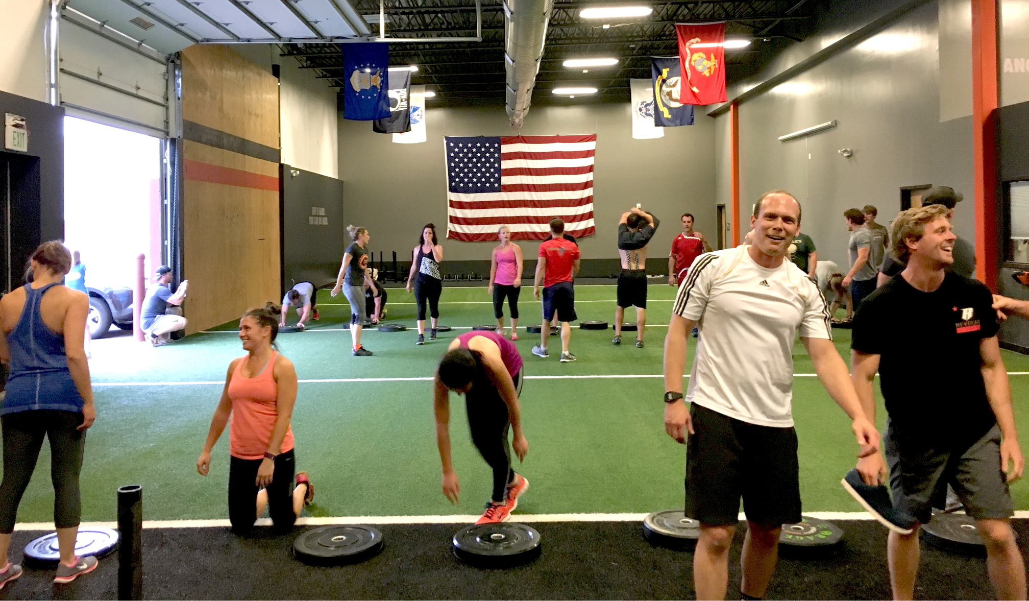
Our challenge was to identify the highest-impact tasks across this diverse audience, simplify and prioritize them for mobile, and make the experience feel intuitive even for first-time users. To do that, we visited gyms, observed members using the old system, and asked what they needed day-to-day. Clarity and convenience rose to the top.
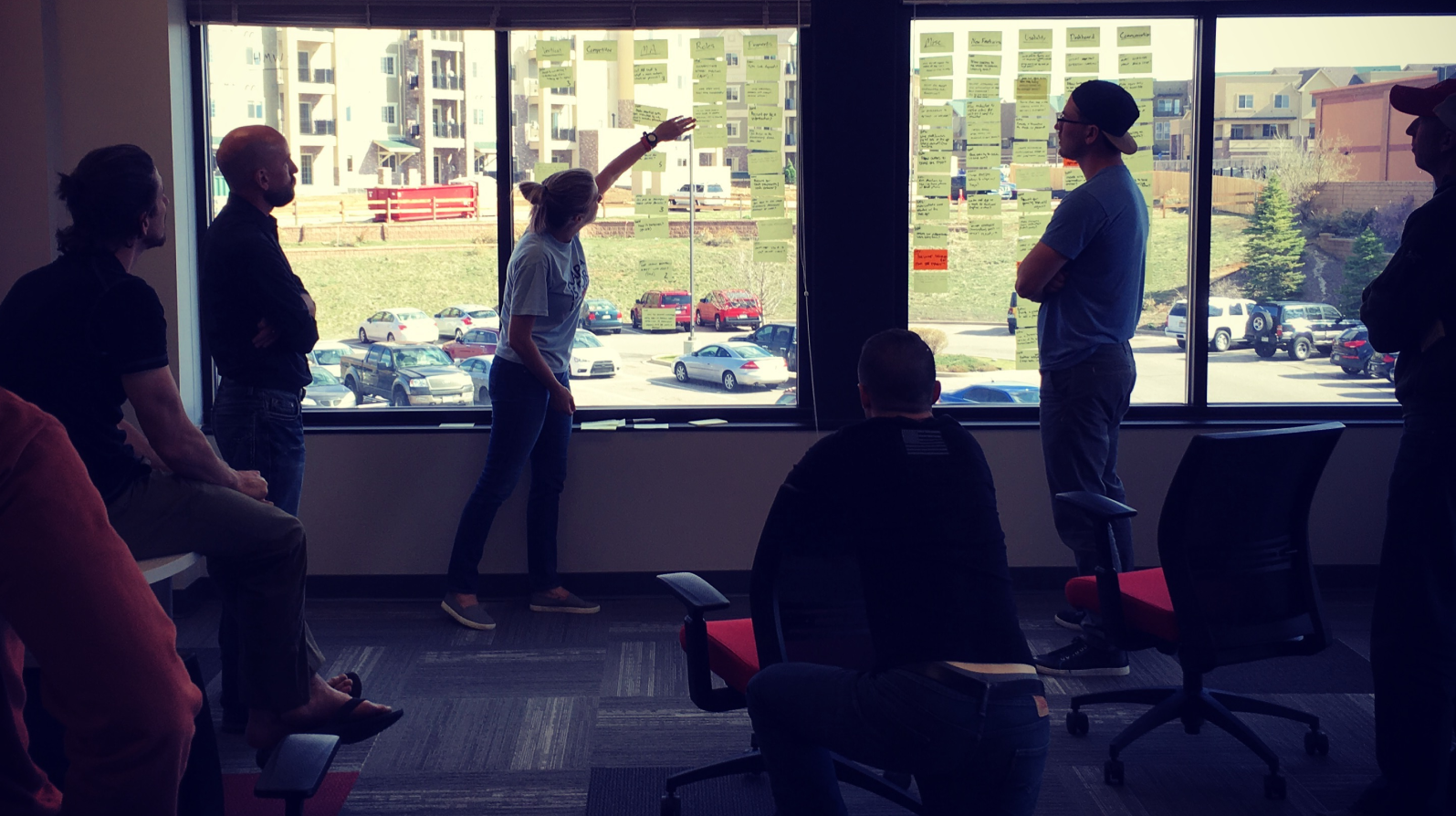
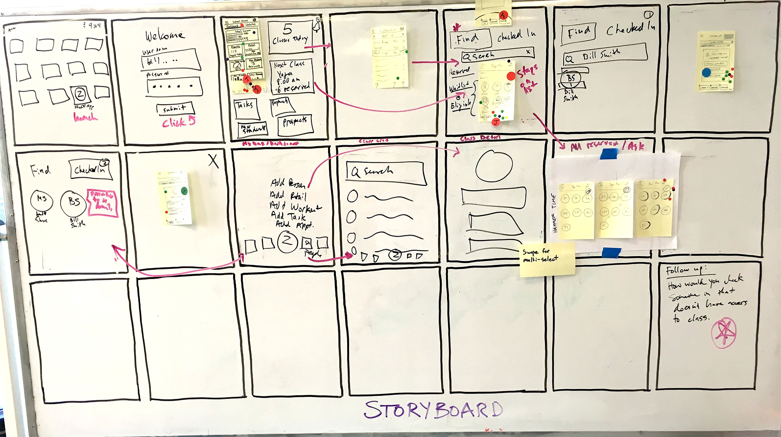
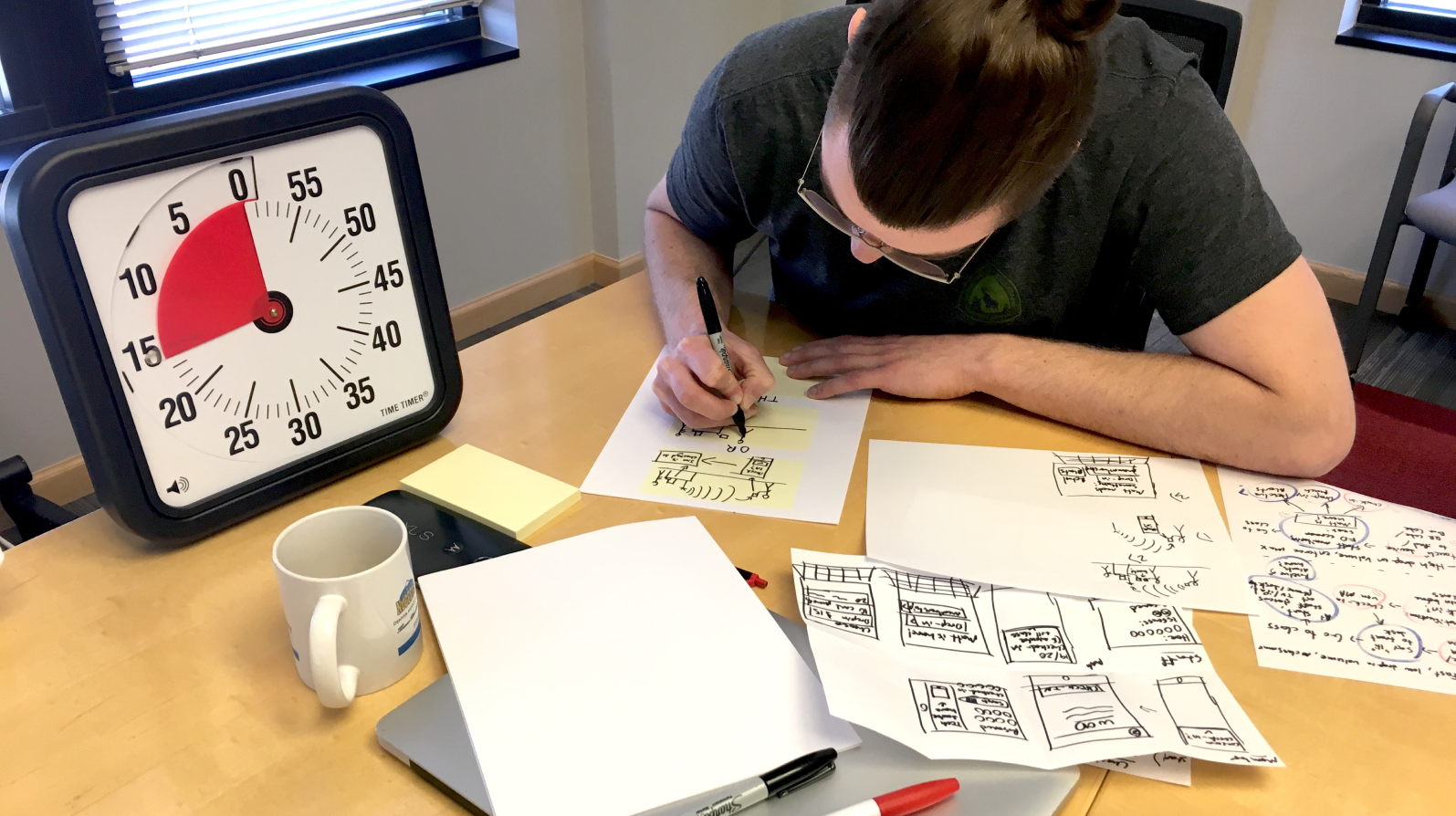
Partway through discovery, we ran a Google Design Sprint with a core group of stakeholders from product, engineering, and customer support. I was not the lead facilitator, but I played a key supporting role by helping plan exercises, guide discussions, and synthesize insights. The sprint gave us a shared vision for the MVP and alignment on the three primary workflows we would design first.
Solution
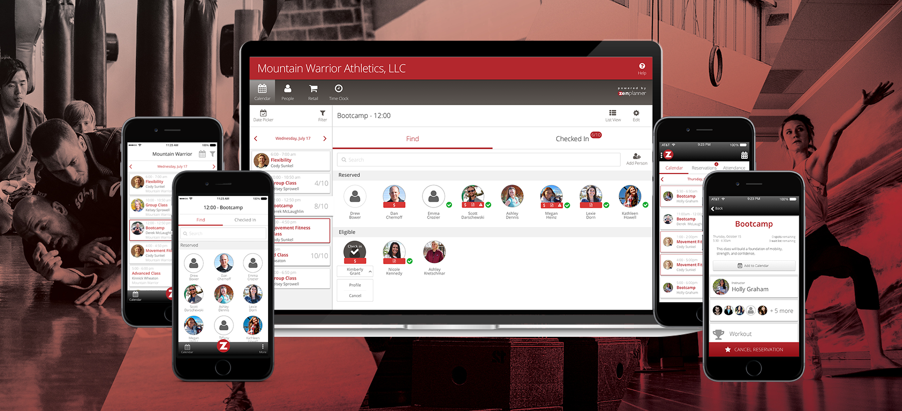
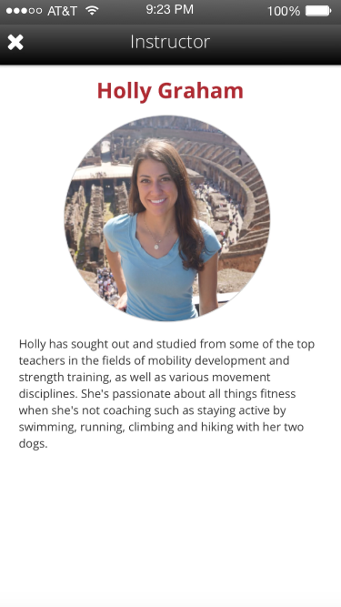
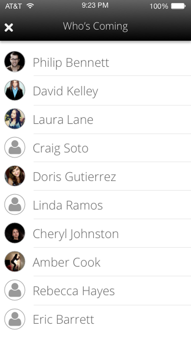
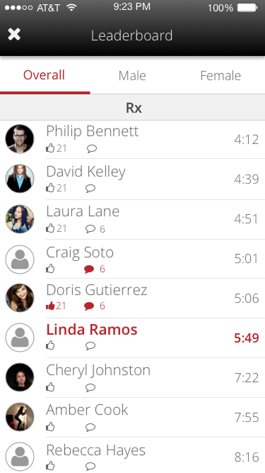
We designed the MVP around three high-impact tasks: reserving classes, checking schedules, and viewing workout plans. Every screen was optimized for one-handed use with minimal taps, clear typography, and instant feedback.
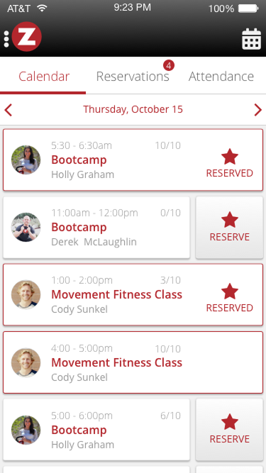
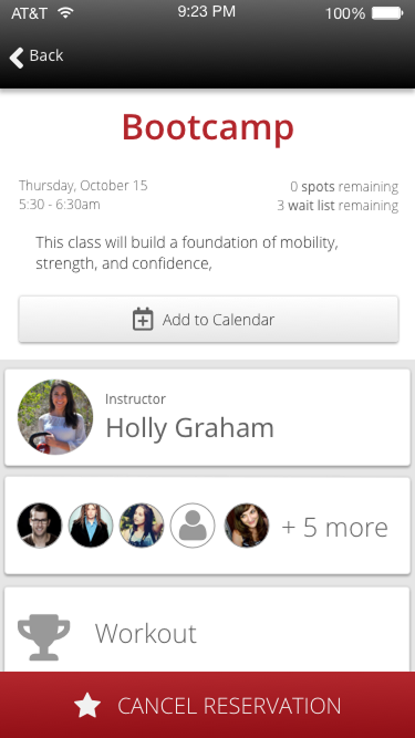
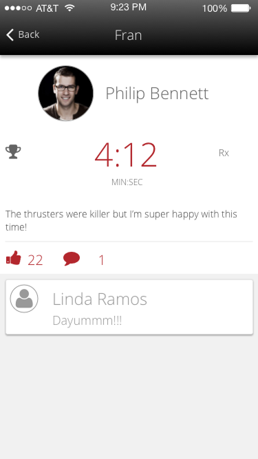
The class schedule became the app's home screen, quick to scan, color-coded by status, and swipeable to reserve or cancel with real-time updates from the gym. Workout views were stripped to only what members needed in the moment, removing all clutter and ambiguity.
I led the design effort from discovery through delivery, wireframing core flows, testing prototypes with real gym members, and refining the UI for both iOS and Android. Partnering closely with our mobile engineer ensured we balanced native conventions with brand consistency.
We also built flexibility into the architecture so studios could control settings like reservation windows, cancellation policies, and workout display rules without needing future redesigns.
Impact
The new mobile app transformed how members engaged with Zen Planner. Tasks that once took minutes (or sent members to the front desk) could now be completed in seconds, from anywhere. Gyms gained a modern, professional tool without additional setup, and members immediately responded to the simplicity and speed.
Within six months of launch:
- 60%+ of member logins shifted from web to mobile
- Daily active users increased by over 40%
- Support tickets related to scheduling and reservations dropped significantly
- Helped retain at-risk customers considering competitors with stronger mobile offerings
More than just an MVP, the app set a new standard for the platform. It created a foundation for long-term product expansion and gave the team a clearer vision of what “good” could look like across Zen Planner’s entire experience.